Color Accessibility in KatFS
Hello everyone! Smaller devlog today, but I would like to briefly share some insights in my initial experiments with making KatFS more accessible to those who are colorblind. I'm sure the vast majority of anyone reading this is at least somewhat aware of what colorblindness is, but just in case I'll describe it briefly as an eye condition where one or more types of light-receiving cones do not work, leading to a deficiency in perceiving certain colors. I'm sure you have already seen one of those tests with the differently colored circles that form numbers and such. A quick and dirty google search says that between 4-8 percent of adult males have some form of colorblindness (0.5% for females), so while it is nowhere near a majority, it's still a rather substantial portion of the population (and thus, of your potential player base!).
So, how can we ensure colorblind people can still enjoy our games?

My initial thought was to put my game under several "colorblind filters". The intention behind these filters is to simulate how people with different conditions perceive (or rather, don't) certain colors. Just add a filter that mutes the colors in question, get a feeling how your game will look to someone that is colorblind, done! Right?
Well as it turns out it's not as simple as that. First of all, the way colors work in computers is different from how they work in our eyes (RGB makes zero sense to our eyes!), so we're already having some translation troubles. Another quick search yielded a webpage that has 7 differently implemented filters based on multiple academic works! And even then they're not likely 100% accurate as every condition has its unique properties.
Upon sharing my initial results from using filters on Twitter, I was approached by accessibility specialist Ian Hamilton (@ianhamilton_) who pointed this fact out (big thanks for the reality check!). Without getting too technical, the different conditions can be categorized in two dimensions - one being the type of cones that are impacted by the condition (and therefore the colors affected), and the other being whether we're talking about a total or partial loss. Partial losses can come in different degrees of severity, so it's hard to accurately estimate how it impacts vision. We could be talking about a 1% impact that is unnoticeable or a 99% that is nearly total.
But there are good news! Even if we can't accurately design for the different partial conditions, we can still design for the cases of total loss of a certain color vision, and these designs should translate to the partial cases - after all, we're talking about a sliding scale between "cannot see a certain color at all" and "can see said color just fine". So with that in mind, let's get to the actual designing part!
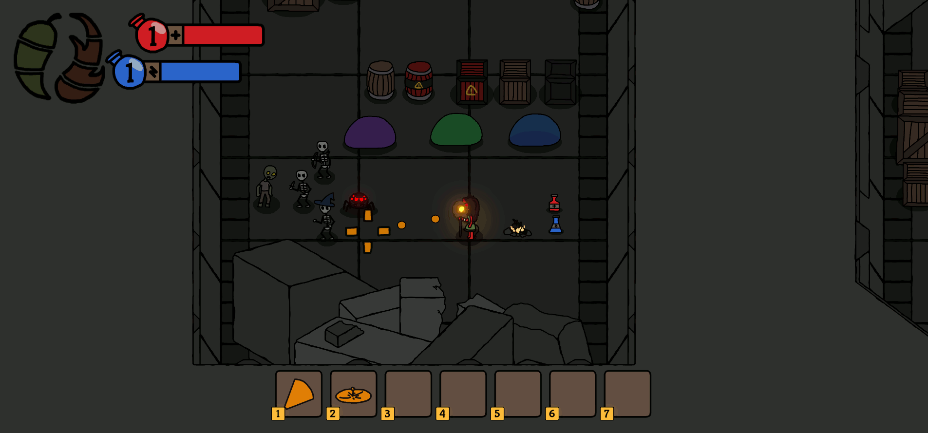
The GIF above showcases how several in-game objects look under the different conditions. We can see what already works and what doesn't. Let's go through some of them:
- Kalia herself pops out reasonably for the most part, thanks to her vibrant colors against the dull floor and her glowing staff
- The health and magic colors are different enough to be recognizable in most conditions, except for complete colorblindness. However, the HUD elements have identifying icons, and the potion bottles have distinct shapes and labels that can be used to recognize which is which
- The explosive variants of the crates and barrels can be distinguished by a combination of their red shade, dark accents and the warning icon, however these could still be applied more consistently
- The spider is instantly recognizable due to its glowing eyes
- The slime types are not easily distinguishable under many conditions
From this list, we can point out some ways to make a game (or any other piece of software, really) more colorblind-accessible:
- Shapes
- Features
- Labels
- Brightness
- Sound effects (not demonstrated here, but definitely possible)
For example, the slimes could be easily made more accessible by giving them distinct shapes features, such as giving the explosive slime some spikes or making the green slime a cube. No need to alter their colors, and it has the added benefit of making the world seem more diverse. There are still plenty of in-game situations that need to be verified, but by thinking ahead and keeping accessibility in mind, we can solve many of these before they even happen!
What about colorblind modes? They can be a good solution for certain cases, but I believe a designer should be careful not to use them as a crutch. It's important to consider how aesthetically pleasing a game will look to a colorblind person, and just plugging in an obnoxious color can make it seem like a bit of an afterthought. I would vouch for a preventive approach instead, where aspects of a game are designed from the ground up in a way to prevent future friction.
As a final note, a designer or developer might be tempted to think "it's way too much work for just 8% of players, why bother?". Ethical considerations aside, it is known that accessibility design can often help people beyond the target condition. We actually already had the example of designing for total colorblindness impacting cases of partial colorblindness. But these design choices could even help players who have perfect vision! Maybe someone has trouble assigning your colors to their intended meaning ("was it the purple or blue slime the one that exploded?"), but once a secondary feature is added it becomes easier for them ("oh, it's the spiked one!"). Maybe someone's eyes are just glazing over and they don't notice a color, but the accompanying sound effect catches their attention. I suggest researching the "curb cut effect" for more on that!
Wow, this turned out longer than expected! See you in the next devlog!
Comments
Log in with itch.io to leave a comment.
Very great!! I like it a lot!! I learned more about color accessibility and how to make a game more colorblind-accessible :D Thanks for making it!!